Сайт за фестивал на словото
Примерен бизнес: ГЛАС. Измислен фестивал. Програма и участници за демонстрацията.
Добавете тази посока към заданието си. Изборът е отправна точка; собствената концепция се подготвя отделно.
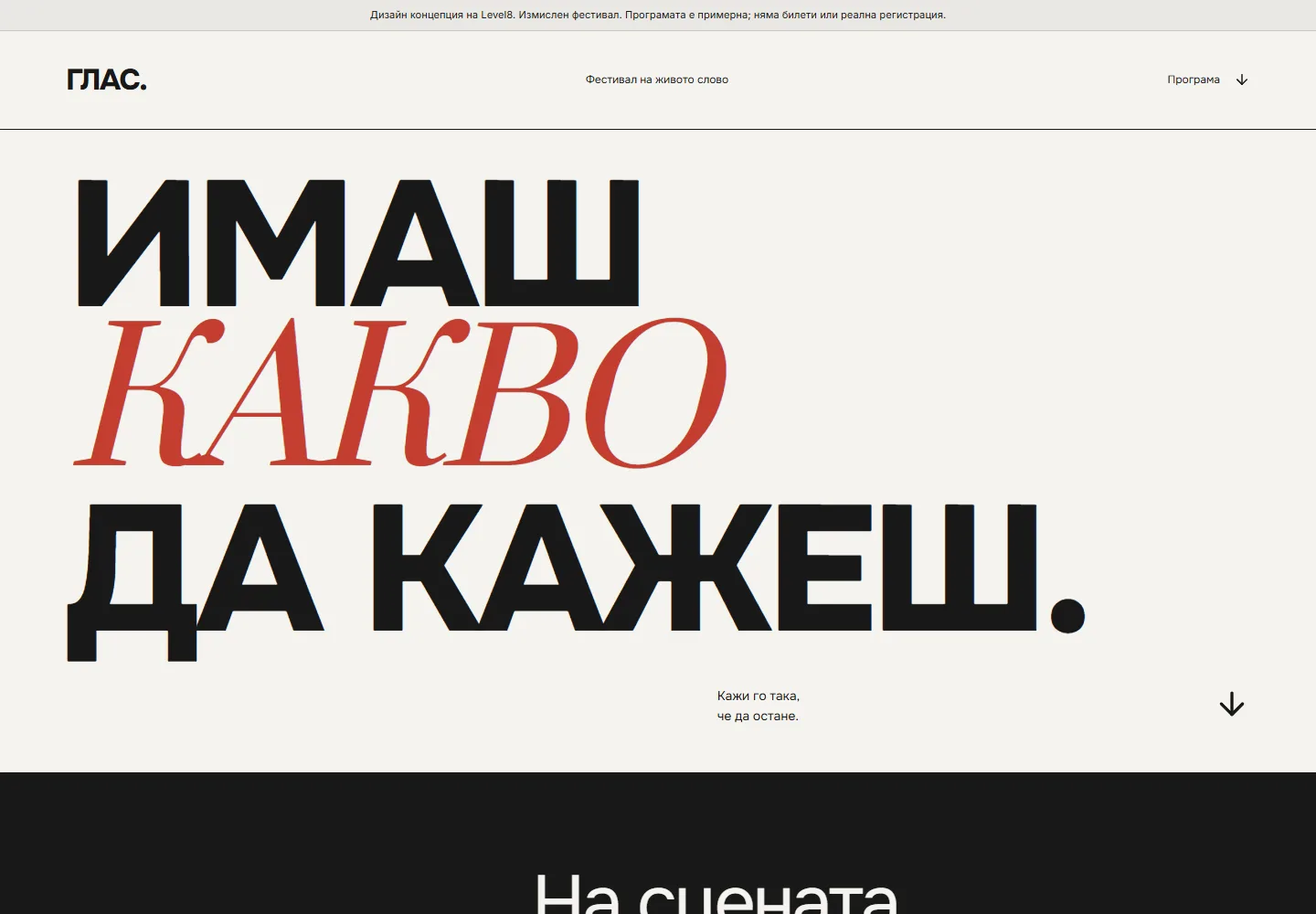
Реален кадър от демото, 1440 × 1000 px. Заснет на 7 септември 2026 г.
Смела Типография
Подходящо за: Представяне на услуги, Публикации и истории, Посока за записване на час. Това е преценка за визуалната посока, не списък с готови функции.
Описание на стиловата посока
Гигантски шрифтове, контрастни serif/sans комбинации и текст като визуален елемент. Минималистичен и запомнящ се. За креативни агенции, мода и медии.
Вижте оригиналния промпт на английски
Design a type-first website where typography IS the visual: hero headline at 12-20vw, tight line-height (0.9-1.0), tight letter-spacing (-0.02em to -0.04em). Pair a high-contrast serif (editorial feel) with a clean grotesque sans. Use scale contrast aggressively: 200px headline next to 14px body. Black on off-white (#f5f3ef) or inverted. Text can break the grid, overlap images, or run vertically. One accent color maximum, used on a single word. Avoid: decorative fonts, more than 2 typefaces, centered-everything layouts, images competing with the type. Build an original, complete composition around the actual business and its visitor task. Use the live demonstration as a visual reference, not a universal section template. Lead with specific objects, useful content and appropriate photography. Use supplied real project imagery; label fictional concepts and generated imagery honestly. Never invent clients, testimonials, awards, usage counts or results. Give every visible control a useful outcome and an accessible name. Use deliberate motion for spatial relationships and state changes; support keyboard, touch and prefers-reduced-motion. Verify desktop and mobile layouts, image loading, contrast and form states. Avoid generic AI slogans, rhetorical em dashes, arbitrary decorative badges and repetitive three-card sections.